|
|
|
|
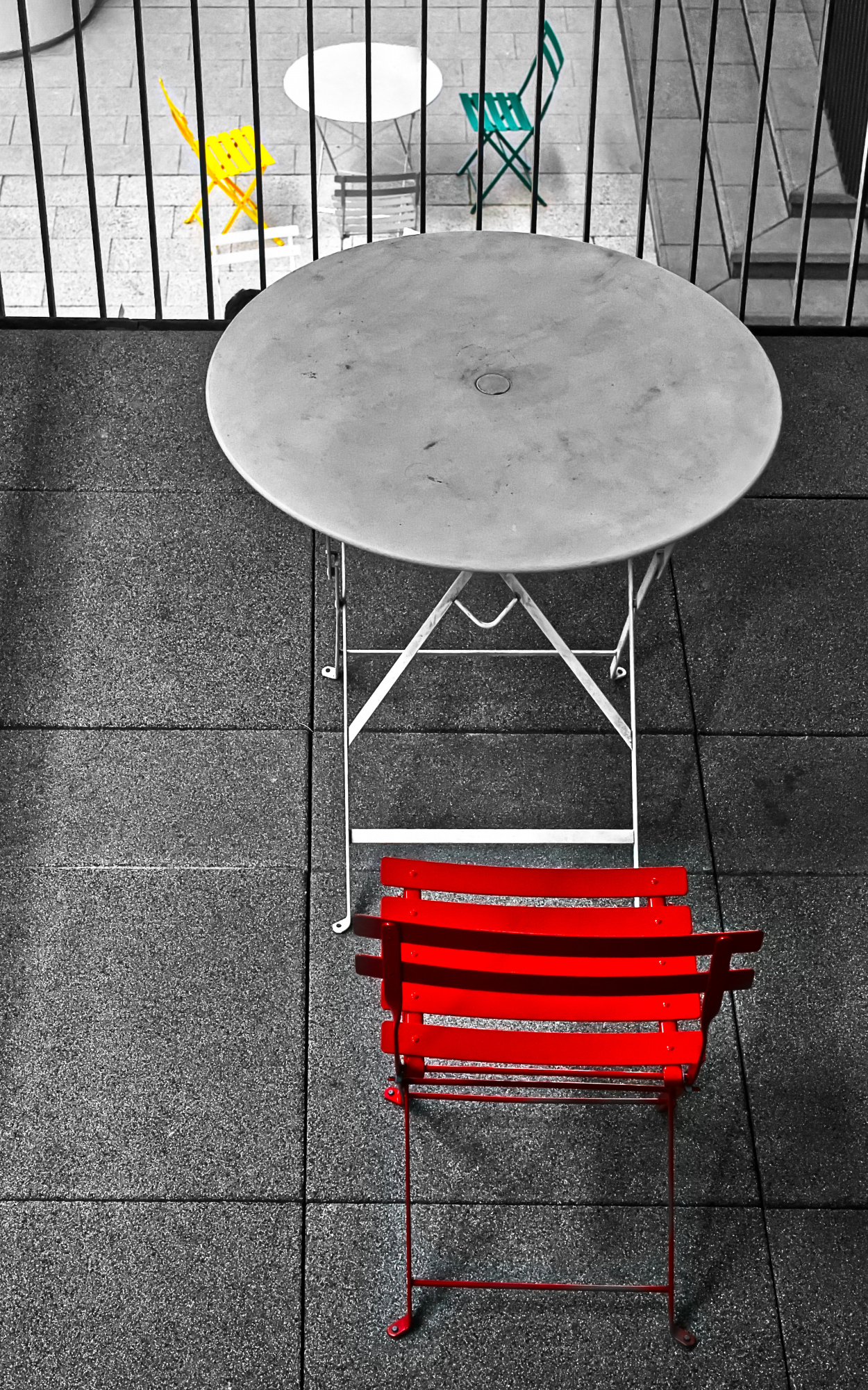
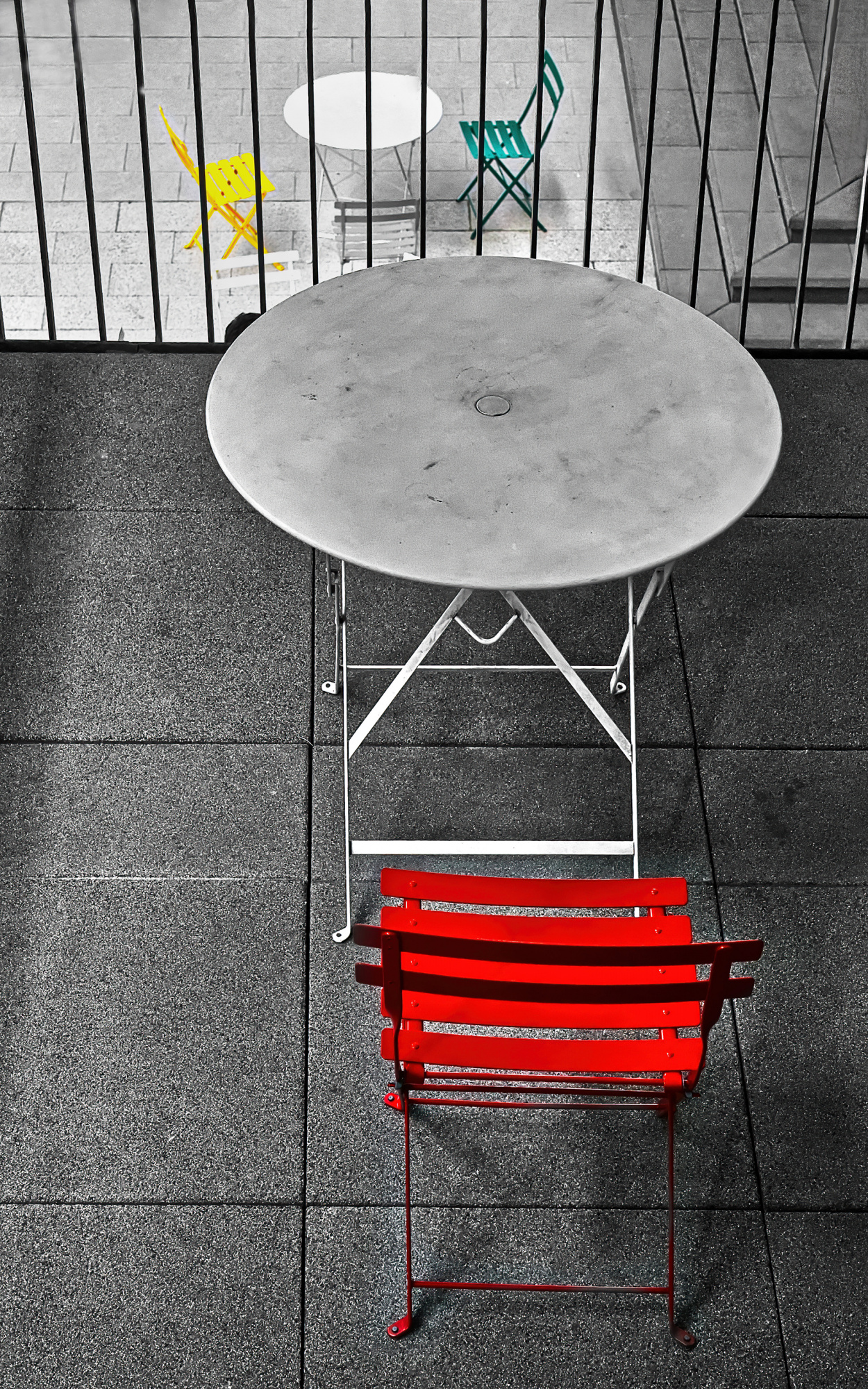
There were red, green and yellow chairs, with a red chair and the arrangement was very interesting, so I photographed it.
When developing the film, I kept only some of the colours and left the rest in black and white so that the eye could focus on the colour of the chairs and their arrangement.
The overall composition of the picture was made with an eye to the golden ratio and to the main subject, the red chair.
I increased the sharpness of the image because of the overall blurred atmosphere. I personally thought it turned out very interesting, but it was not select.
I don't know what more (or less) I can do with this photo.
Any advice would be appreciated.
Maki,
Thank you for sharing the photo. My one suggestion is to simplify the composition further by removing the black object dangling from the top left, and removing the dark area on the steps at top right.
Photoshop's 'Remove' tool was used at the top left and top right.
Some extra space was added to the top with the 'Content Aware' option of the Crop tool.
Just suggestions. A simplified compositon can intrigue viewers by appearing more deliberate, showing them just the important details without distraction.
. . . . Steven, senior critic


Hello, Maki
Welcome to our forum.. I can understand if you feel discouraged or disappointed with the curation results. We all wish to pass through this process with success. However, sometimes the result comes vey disappointingly. When looking at the image and its title, the image makes quite sense. Keeping some of the color seems like a good idea. Yet, the genre makes me think. This is more close to conceptual photography than abstract to me. As my friend mentioned there are some. distracting elements in the image.I also agree with his suggestions. Apart from that I myself don't like the composition. The big round table looks too prominent. Although the name of the image directs the eye to the red chair comparing its state with the green and yellow couple, the eye shifts fast towards the table. Furthermore, there is not an attractive element in the image. That is the composition is not strong enough. It is not nice to be reminded of something like this but a good composition makes a big start. It is good to have various geometric shapes in the image but there seems to be a weak design here. This is what I think of course. Because of the flaws in composition I do not think that we could achieve a great change on this image. However I hope that you keep these points in mind for future images...I wish you good light. Cicek...
I saw this photograph when it came up in the curation queue and I voted to reject it. No matter how interesting an image is or appears to be, when it is photographed it simply doesn't work. For me that is the case here. One thing that would make it better for me is a better arrangement of the chairs at a lower level. I would like to see the yellow chair at the 9 O'clock position and the grey chair at the 6 O'clock position. The white chair is a distraction and would be best removed from the frame.
Even if you had arranged the chairs before taking the shot, I would still have voted to reject it as the vertical bars are simply too much of a distraction.
All just my opinion you understand!
Maki,
It's my habit to look for meaning, purpose, or story in a photograph. The story here is about a 'table for one' - an empty chair and table contrasted with the table for two in the background. We can see the table for two, but we can't get to it because there's a fence or railing that prevents that. It's a sad story of loneliness. If there were a couple sitting at the lower chair, or if we imagine them there, it would complete the story.
Perhaps I try too hard to find meanings, but, as Joseph Joubert said . . . . 'You will find poetry nowhere unless you bring some of it with you.'
. . . . Steven
