|
|
|
|
Hello,
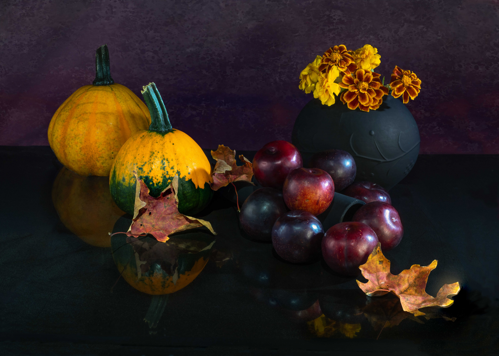
I created this still life with plums and pumkins and submitted it to curation. The image was rejected (like many others in my portfolio)... I actually don't beleive the image made it to the curators as it score too low on the votes. While I do understand that there is no way to tell why iot was rejected, I'd like your opinion and advice on the image so that in the future I may be able to improve. I am guessing that the composition was a major factor (too many elements?, too crowded?) but I'm not sure.
The image was shot with a one light set-up and a white card on the left to fill in shadows. The table was a black granite tile. I use the high resolution mode from Olympus, five images were focus stacked together and then cleaned up for dust and distracting elements. Technically 1/10 sec F8.0 ISO 200 and shot at 29mm on the M.Zuiko 12-40 F2.8 Pro lens. Attached you will find a lower resolution image of the original photo.
Thank you in advance for your critique

Hi Pierre...
I think your collection of items shows it was well thought out - definitely a fall scene.
I feel it fell short with the background and dark reflective surface. In my opinion, the reflections aren't strong enough, so it's actually more of a distraction than a highlighted feature.
I would love to see this array of objects on a wooden surface and a more neutral background. This way, the black vase will stand out more (as it is somewhat blending into the background and the surface it's sitting on).
I hope I have been of some help,
Darlene
Darlene, I thank you so much for your critique. I was under the impression that there were too many objects but now that you mention the background and surface it is somewhat obvious. It just need someone to point this out.... It's funny because I actually tone down the reflection while editing so I guess that my subconcious figured there was something wrong with it. I'll try to take the habbit of posting on the forum first. BTW, I look at your portfolio and your images are awsome. Thanks again for helping me out...

Hi Pierre - I do a lot of still life work and several things jump right out at me. The first has already been mentioned, the way that the background is not providing enough contrast Moving up the mid-point in post-processiing will partially correct that issue, but a different base and background would help even more..
Another issue that I see is that arrangment does not have enough variability in height. Your vase and the pumpkins are roughly the same height. If you look at the old Dutch masters, their work had a tall central "pivot point" where all the movement fell from. They typically worked in layers from tall to shorter objects. This layered approach is used in the "New Dutch" style as well, only with far less formal rules than the Old Dutch. If you like simple, look at the work of the Italian painter Giorgio Morandi as his simple style has influenced a lot of contemporary still life photographers.
Take a look at Tineke Stoffels's website as she is a contemporary Dutch photographer who workrs in all three of those still-life genres. https://tinekestoffels.eu/portfolio
One other point in still life work, objects like your plums need to look random, rather than orderly to be more effective. If you want to be orderly, that can be done but the image has to be a lot more graphic (there are some examples of that on my 1x.com page).
Manfred Mueller
Dear Pierre,
Thanks for visiting the "Critique" forum. I'll keep it short and I'm not a still life expert. The light source you used is too small, it caused speculars ob the most glossy elements, your apples. If you want to simulate window light, size matters. Secondly, light falls off to the square. If you have been close, the decrease of luminosity is more significant than from further away. Your pumpkins hardly show any shape becasue they don't have shadows. You had to light them up with a soft reflection, which tthen gives an unnatural, mixed scenario lighting. I think t would have been better to put them to the right and your vase to the left, because that one is dark anyhow. But I can't tell for sure.
My other point is that I feel you shot from too high. It's almost like a "regular" eye-view height from a 2-3 meter distance. It's more common to shoot from a little deeper, since unusual perspectives (compared to real life) appear more interesting, in this case also more direct. Probably you would have lost your reflections then and they made you raise the camera that high?
Best regards,
Mike - SC

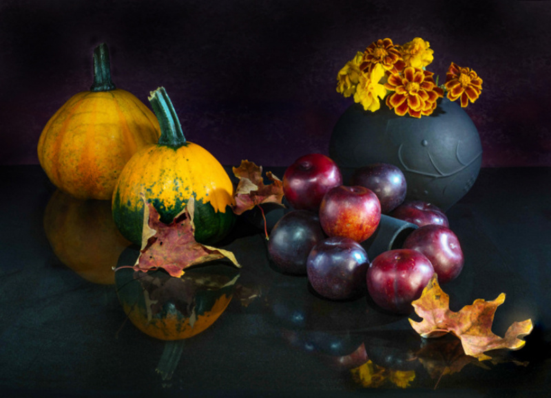
Hi Pierre Desautels PRO --- @ I've found a photo of your still life on this critical forum, a photo accompanied by the recording data you used + the lighting tools you also used ...Thanks for that. You've also written a review on how this photo masterpiece was made. Interestingly, this photo has received visits from Darlene Hewson PRO, Manfred Mueller and Mike, all of whom have provided excellent opinions. I have also read the review provided by Manfred Mueller, one review that was quite interesting for me (especially for still life images). I am not an expert in still life, so his review was very interesting for me to follow. I also think...you say the photo has been rejected by the curator, but I think you are quite lucky, it turns out that what you are doing has received a lot of attention, I am also interested in Pierre, just for the next...allow me for a bit/ no feedback for you, but you can follow "whatever I do with your photo, do a test I did. --- @ I have borrowed your photo to do this test...* I try not to changing the existing composition, because I saw and thought, the composition is quite interesting for me, I tried to draw a 'diagonal line' from the two pumpkins to the dry leaves on the right side...both parts have given a 'balanced' color of emptiness in the middle area you are filled with maroon fruits. On the other hand you place a flower holder with yellow flowers, across the bottom left again you put dry leaves, d In this case, I alsofeel an acceptable composition. So speaking of composition, I don't think it's too problematic, just a possibility for the future, if you are really interested in the still life category, you will be challenged to become 'a director...* Photo sharpness and the lighting you used for me is quite good...* Furthermore since you mentioned..."put the subject of the elements on the granite tiles"...I tried to find the reflection effect, I have tried to touch the light zone so that the reflection can be seen feel (in this part of the granite, I have raised from dark to slightly light), But this step of mine ... I found something that needs to be improved too ... apparently, the granite countertop "seems tilted" in one direction, which I finally did repairs too. I did this because I was going to ..."wipe the walls" in order to give a touch of contrast to the existing fruity colors. ---@ That's all the tests I did, the results I include in my description. Hopefully it's of some use. And thank you again for this opportunity. Healthy greetings always for you...Johanes Januar -- SC


Hi Pierre.
Just another look.
Don't pay attention to the processing errors that are made fast and with few mania :)
Greetings.
P.S. I hope the translator did a good job.
Darlene, I thank you so much for your critique. I was under the impression that there were too many objects but now that you mention the background and surface it is somewhat obvious. It just need someone to point this out.... It's funny because I actually tone down the reflection while editing so I guess that my subconcious figured there was something wrong with it. I'll try to take the habbit of posting on the forum first. BTW, I look at your portfolio and your images are awsome. Thanks again for helping me out...
Hi Pierre....
You're very welcome - glad I could help. I also wanted to mention that focus stacking can sometimes be a giant pain (I do see you had a slight issue with it in one of the leaves). Try shooting the scene with just one frame - less fussing around! :)
Thank you for your kind comment about my portfolio - much appreciated!
Darlene
Manfred, I thank you for your critique and I really appreciate that you pointed out places I can look for inspiration and learning along with some very good advice. Will keep learning and try again. Your glass photos are amazing as I'm aware how difficult it is to photograph glass without having bad reflections all over (for me anyway).
Mike Kreiten, Thank you for your critique and your are 100% correct... my light source was small and very close. I do have a big light box and a shower curtain so next time I'll work in a bigger room and see if that helps. The pumkins "shadow" was killed by the white card I had on the right. I thank you a lot for your advice.
Johanes, you are always encouraging to me and for that I really appreciate. Yes, the image look better with the "wall" gone or almost gone. I thank you for your critique and suggestions.
Josep... I'm amaze on how you manage to get the reflections in the plums so nice? I was strugling to get them soft and not bluish. Thank you for taking the time to critique.
Josep... I'm amaze on how you manage to get the reflections in the plums so nice? I was strugling to get them soft and not bluish. Thank you for taking the time to critique.
Pierre......to change the blue reflections and catch-lights to white, just desaturate the blues in photoshop.
Darlene
Josep... I'm amaze on how you manage to get the reflections in the plums so nice? I was strugling to get them soft and not bluish. Thank you for taking the time to critique.
A larger and / or closer source of light is how they tell you what was missing to improve reflexes.
What I did to disguise the harshness of the reflexes was:
-Duplicate layer.
-Remove the reflections with the cloning tool, brush or whatever comes to mind.
-80% layer transparency
-New layer. White brush and paint the new reflections.
-Gaussian blur filter to taste.
-Recover the transparency of the layer 100% and ready.
P.S. I hope the translator did a good job.
Yes that would work... on a separate layer then mask appropriatly.
Thank you for the detail procedure... I'm slowly learning photoshop so it's a bit of a struggle. I will had the procedure you describe in my book of tricks.
Mike Kreiten, Thank you for your critique and your are 100% correct... my light source was small and very close. I do have a big light box and a shower curtain so next time I'll work in a bigger room and see if that helps. The pumkins "shadow" was killed by the white card I had on the right. I thank you a lot for your advice.
You're very welcome, Pierre.
The thing with lightboxes is that light is not directional. Window light is, since the sun is pretty far away. So you probably have to experiment quite a bit if you use flash light. A beauty dish with honeycomb makes light quite directional, but it needs size and only works properly with studio flashes. And mostly these dishes are 50-80cm, at least the affordable ones. I think it's easier to work with reflected light from a bright, big surface. Then it needs to be a strong flash again. Steady LED light in a shine-through setup is easier to handle, since you can expose longer for more brightness in the scene.
He's my king of home-made light setups, probably he'd go for a piece of shower curtain or build a framed baking parchment to light it up, Don Gianatti. See his light tinkering in this video for example: https://www.youtube.com/watch?v=LDtPzj-KiqY
Best regards,
Mike
Thanks for the link to the video... this will help a lot
Manfred, I thank you for your critique and I really appreciate that you pointed out places I can look for inspiration and learning along with some very good advice. Will keep learning and try again. Your glass photos are amazing as I'm aware how difficult it is to photograph glass without having bad reflections all over (for me anyway).
Thanks Pierre - The secret of strong and effective glass photography is back-lighting the subject and working in a room where the camera does not pick up reflections from other light sources (not that big a deal when you shoot with flash light source, but can be if you are using other light sources).
Fruits and vegetables
Manfred, I thank you for your critique and I really appreciate that you pointed out places I can look for inspiration and learning along with some very good advice. Will keep learning and try again. Your glass photos are amazing as I'm aware how difficult it is to photograph glass without having bad reflections all over (for me anyway).
Thanks Pierre - most food (fruits and vegetables( are quite reflective and produce hot spots like we see in your image. I have started using a more sophisticated lighting technique to light the subject in a way that results in less obtrusive highlights. I do have studio lights at home, so I can rig this up fairly quickly.
I angle a softbox obliquely to the subject and have a scrim to soften and scatter the light hitting the subject. The light hitting the bottom edge of the subject is quite hot, hence the flag to knock that down. I was doing an overhead shot, but this technique is just as effective for shots that are taken straight on.
You can still see the hot spots, but they are far more gentle,
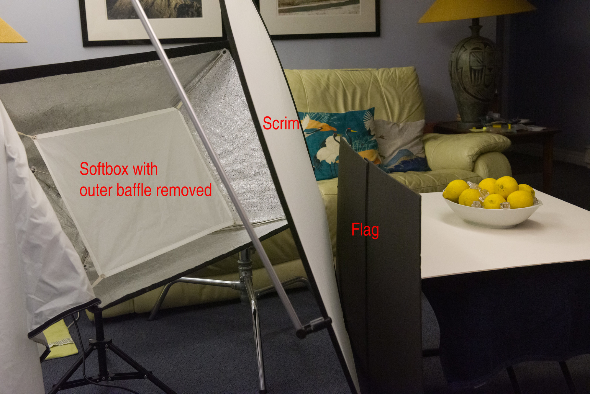
P.S. This is some of the same equipment I used for the glasses, although I now use a piece of white, translucent Plexiglas instead of the scrim. The "secret" for effetive glassware shots is to back-light it. The technique I used for them is referred to as "bright field lighting".
P.P.S - I see you are from Canada as well; I'm in Ottawa and we are very fortunate to have a fine art photography school in town that teach this stuff.
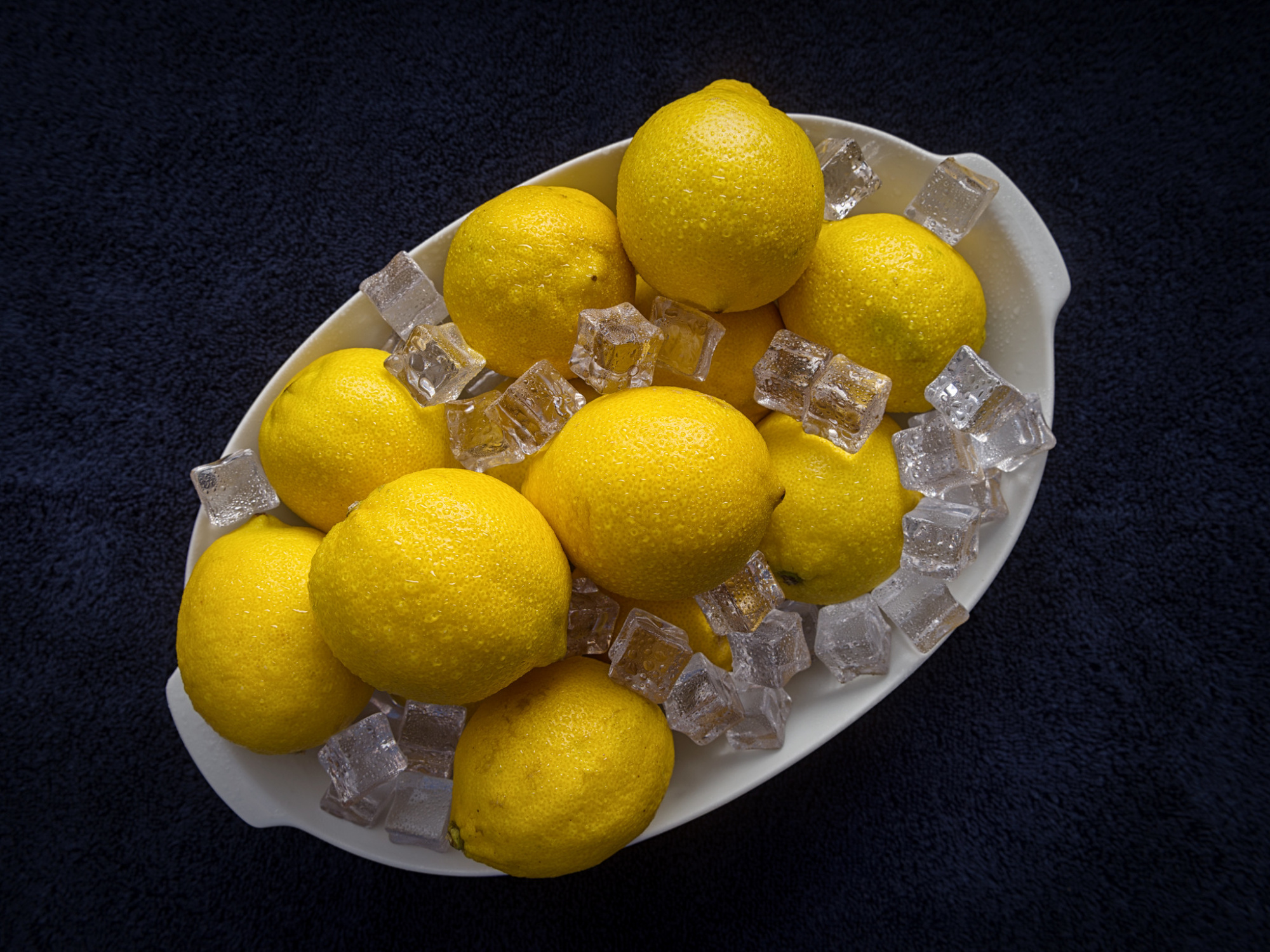
I like the lemon shot... the fruits are nicely shaped by the soft shadows without bright spots... I also notice your ice cubes are clear. Your light are close enough to the subjects so that's encouraging considering the space I have. I'll hopefully try agian next week on another fall shot and see if all the advices I received paid off.
Thanks a million.
PS I graduated from Ottawa U (geology) and after working all over the country, now I'm in Barrie... not so good for art school here except in TO.
The ice cubes are acrylic ones I bought on Amazon; real ones melt too fast and the splashes of water are a glycerine / water mixture that beads, rather than running off / drying out during the shoot. The lights being close are what creates the soft light that we look for in this type of shot.
I grew up in Toronto, so went through Barrie quite often as a child on the many summer visits to Lake Simcoe. We had friends in Barrie, who moved to Wasaga Beach a few years ago, so its still a place we go by on our trips back to Southern Ontario.

Hello,
I created this still life with plums and pumkins and submitted it to curation. The image was rejected (like many others in my portfolio)... I actually don't beleive the image made it to the curators as it score too low on the votes. While I do understand that there is no way to tell why iot was rejected, I'd like your opinion and advice on the image so that in the future I may be able to improve. I am guessing that the composition was a major factor (too many elements?, too crowded?) but I'm not sure.
The image was shot with a one light set-up and a white card on the left to fill in shadows. The table was a black granite tile. I use the high resolution mode from Olympus, five images were focus stacked together and then cleaned up for dust and distracting elements. Technically 1/10 sec F8.0 ISO 200 and shot at 29mm on the M.Zuiko 12-40 F2.8 Pro lens. Attached you will find a lower resolution image of the original photo.
Thank you in advance for your critique
Hello
Just saying "hello" back to you my friend
Hello my friend.
ur welcome.
Hello my friend.
ur welcome.
