|
|
|
|
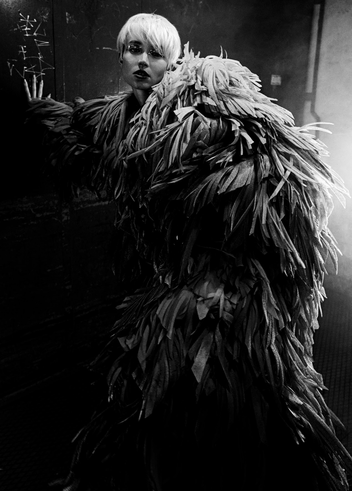
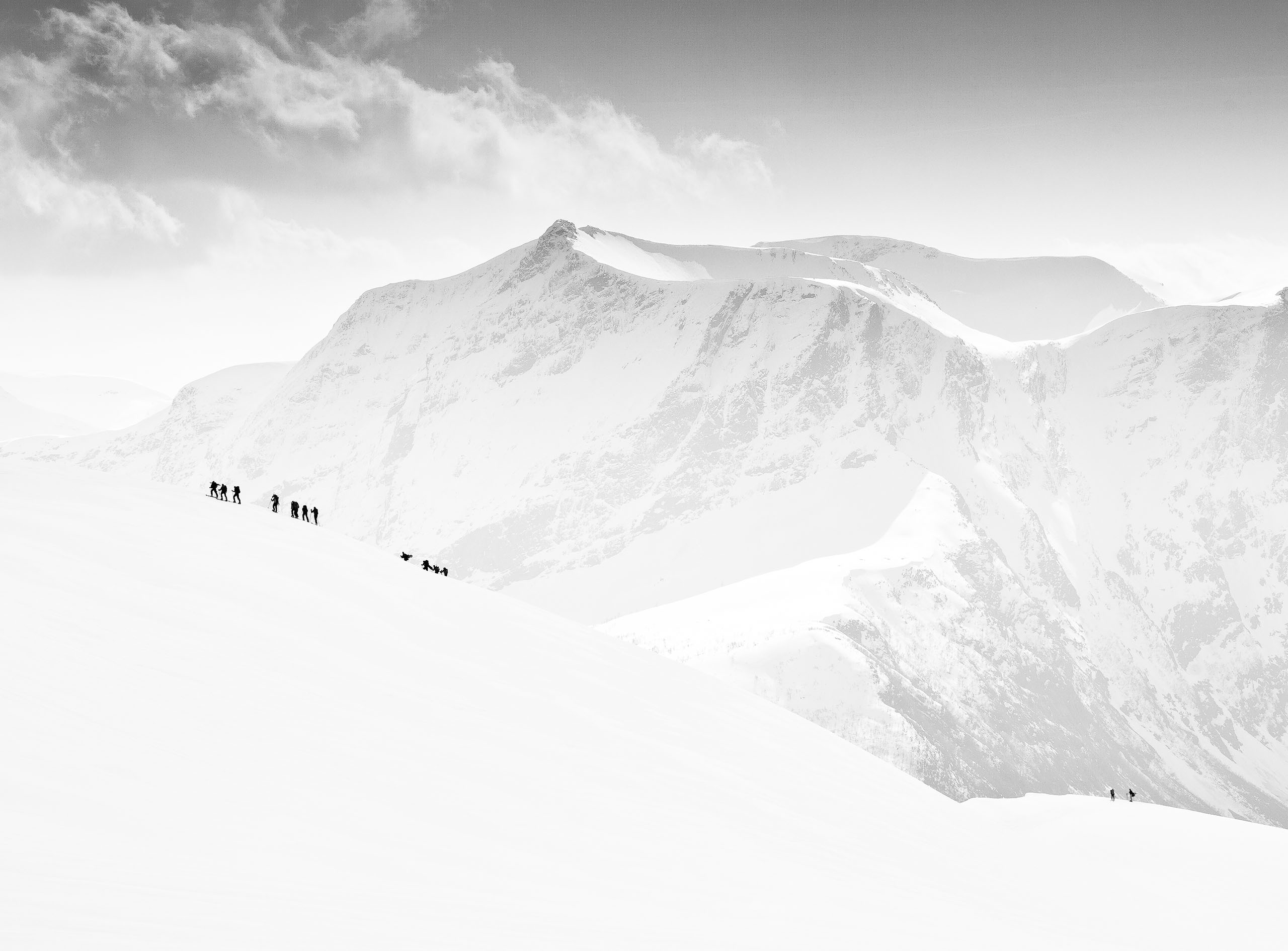
The light at the top of the frame is distracting and is easily cropped out. The light to the centre right of the frame is also distracting but it is much more difficult to deal with. Moving the subject away from that light source before the shot was taken would have been the right thing to do. I presume this was shot on a digital camera. The great thing about digital is we get an opportunity to review what you have just shot. If you had spent a few seconds looking at the image after exposure you would have seen the distracting light in the centre right frame and you would have moved the subject. You do not always need the opinions and comments from others to help you improve. Try to learn from your own photographs. Be your own critic.
Upping the contrast a little would help too.
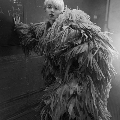
Hi and welcom good looking image well done both of you. This is my take on your fine image. I first put a tilt and a little cropping. Cloned out some distractions Nik Tool Total contrast to help contrast. Topaz AI sharpen with noise reduction... Last some dodge and burn tool work...
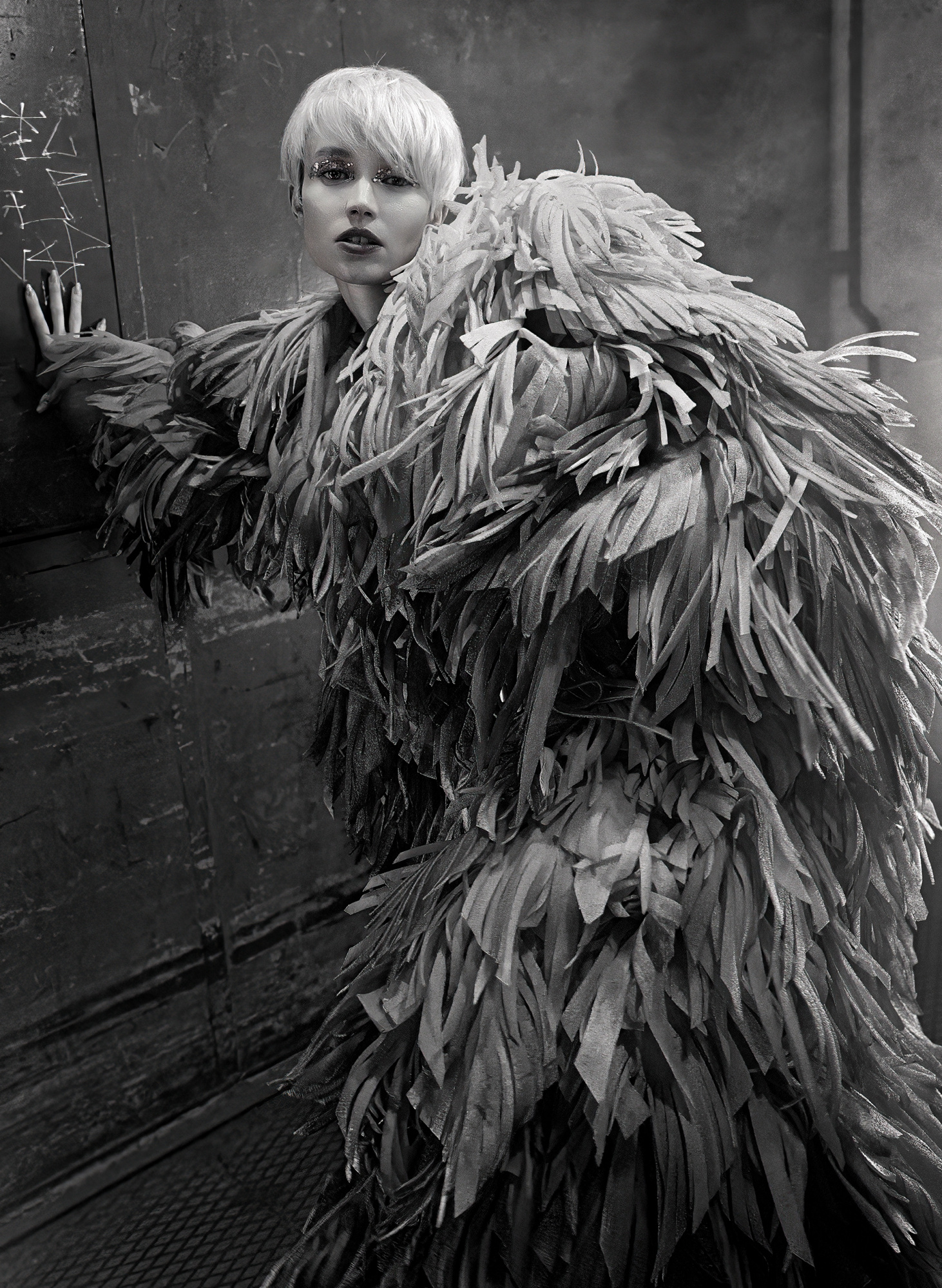
By changing the compoistion and as previously said eliminating some highlights your photos becomes much better in my opinion, a little darkening and removing some highlight spots is helping too.
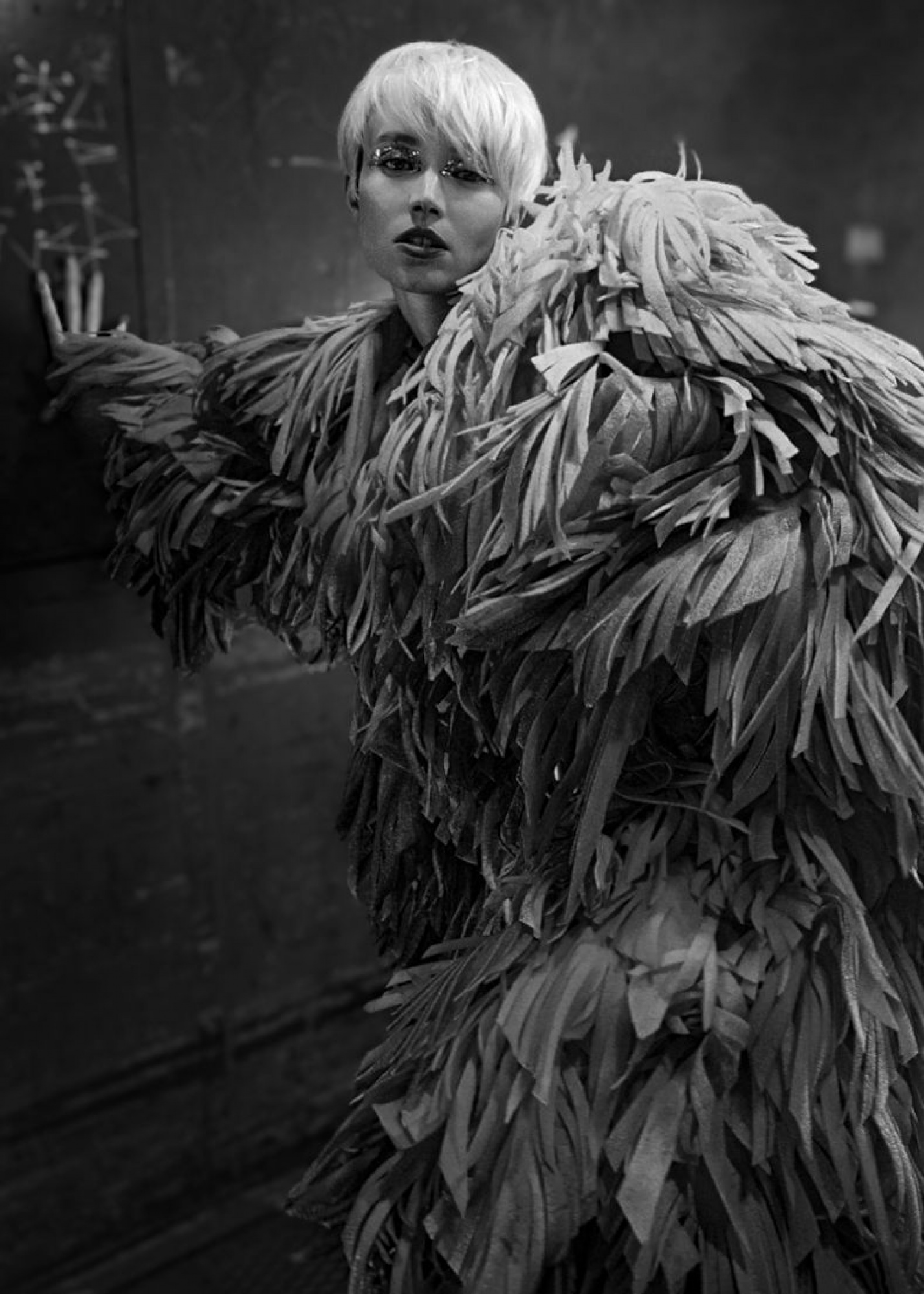
This is a fantastic image that blends art, fashion, and mood in a really cool way. Every element contributes to the visual story. Her wardrobe has a Nick Cave "Soundsuits" vibe, and I love it. The attention to detail in styling and set design is genuinely impressive.
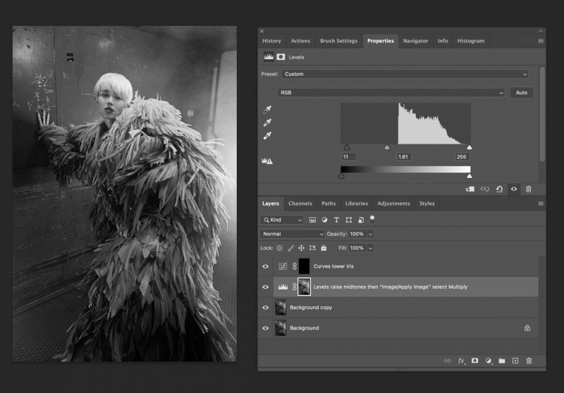
I wouldn’t crop this at all, the composition is super strong, like something you'd see in W Magazine or Vanity Fair. The only changes I’d suggest are small: clean up that sliver of top light and drop the wall light highlights about 50 percent to keep the focus more on your model. A slight overall lift in light and contrast using a levels layer to raise the midtones, then "Image/Apply Image" set to multiply, would help guide light to the right places and a tiny bit of light in the lower iris and whites with a curves layer to draw attention.
This is already a strong image. If you’re this new to photography, I can’t wait to see where you go from here.

Hello, Retvae
Welcome to our forum and thank you for sharing your image with us. I wonder why you did not take the model comepletely frpm top to toe wşth more space in the background. Was there no placeto move back or do you not have a wider lens. This image is definitely worth viewing from afar. The pose is attractive to the eye. My biggest concern is the composition. With a better composition this would have been a much much better image. I like the model, her outfit and her pose. There are many details to take into view. In addition to the composition, I advise you to blur the background a bit and increase the contrast. You can also do this with some dodging and burning. There are tons of tutorials on Youtube about this. I do not know if you use Photoshop, Lightroom or any other editing software. On Youtube you can find tutorials for any of them. I also advise cropping as there is too much space above the head. That is not much advised in portrait photography. Let me show you what I mean with a snapshot. I wish you good light...Cicek

Hello Retvae
Thank you for sharing this fashion photo with us. I love the pose, the model's expression and the tones; the way her brightly lit fingers spread out below the marks on the wall is a brilliant touch. I am rather late commenting and I agree with much of the advice you have already received, but I wanted to try working on your photo a little. I have cropped the top edge and darkened the shadows somewhat to create a little more drama and make the model's face, hair and fingers stand out more. I'm looking forward to seeing more of your work.
Good light, Elizabeth